Evaluation.
For this coursework we where asked to create a film trailer of a chosen genre, along with two sub task’s which where a poster advertising the film and a magazine cover promoting the film. This task required us too use various different skills form the foundation product, for example things like using software such as Desk top publisher (DTP), Adobe Photoshop 7/CS3 and Adobe premiere pro 1.5. These are all software for the hardware which is a PC, we used a PC as apposed to an apple Mac because it allowed us to work in different environments, and transfer work from the college computers to home computers with out converting anything. We also had to use other materials such as a video recorder, which was a Canon MD205, we used this video recorder because it was hand held and really portable, also because it recorded footage on a mini DV which is digital. Which allowed us to plug the camera into a computer by using a fire wire, also because it was digital we could copy and copy our footage and it would stay the same, it never lost the quality of the footage, and could re-do anything we didn’t like. Adobe premiere pro 1.5 which was a new piece of software to use, this programme allowed us to watch out footage and edit it to how we wanted it. We had various different tools to use like the Video clips AV1, Monitor window and the Timeline these allowed us to do what’s called non-liner editing. With this software we could add effects to out footage that we weren’t able to do during the filming such as things like the ‘blink of an eye effect’, changing the colour of footage and slowing down some of the shots. Adobe Photoshop 7/CS3 (The industry standard photo manipulator) was rather new as well, in the fact that I hadn’t really used this much in the foundation product. There where so many different tools to use which where all located on the left hand side in a toolbar/palette. I mainly used tools like Crop, Scale, Magnetic lasso and the clone tool. This was a good programme to use because it is constantly updated and used all over the world which means you can edit your work anywhere. There are two different colour systems the RGB (Red Green Blue) system which makes colours look good on screen and the CMYK (Cyan Magenta Yellow Black) which is the international colours system to upload your work to the internet. Desktop publisher was mainly a piece of software I used for the foundation product I didn’t really use it that much this time round because you had to change all the dimensions of the page, the printer cropped borders. There was a technological restriction because the screen was too small so then the body text was too big it was 14pt when it should have been 11pt which is a magazine body text. We also used blogger which we used in the foundation product to upload our work to the internet. This was good to use because it was assessable for any computer in the world, we never needed to print out work which prevented us form losing anything. Was easy to the progress made and editable, its part of a rich media environment with online polls. There where also a few bad points to using blogger which where things like it was open to plagiarism and within and educational environment it was restricted.
My brief was to create a promotion package for a new film, to include a teaser trailer, together with two of the following; A film magazine front cover featuring the film.A poster for the film. For my research I started looking at the history of film trailers so I could find out when the first one was and how they where first made also how technology has changed. I then looked at all different genres of films so I could decide what I want my film trailer to be, once I had seen all the different features I decide to make a horror film trailer. I then researched all the different sub genres of horror such as Psychological such as Psycho and The shining, Religious such as The exorcist, True Story such as Wolf creek, Monster/Gore such as The Decent, Psychological/gore such as Saw and Gore such as Texas chainsaw Massacre. I also watched the trailers of these movies so I could see what things they used. Once I had watched the trailers and analysed them I looked at the codes and conventions of horror films, so I could have an idea of what to put in my film trailer. Each trailer I watched where all very similar with having a killer and victims, also when watching them by the music you could tell that something was about to happen, so during my planning I had a killer and victims to put in my trailer, also I had dramatic music which I got of a sound track of horror movies. To meet the audience’s expectations in my planning I did a questionnaire, which asked a range of males and females, their age, sex, favourite movie genre and why they liked this particular genre. Then I took the results to find out that teen agers and young adults like horror films so this helped me plan my trailer around accommodating my set target audience. I then wrote down my different ideas and asked friends what they thought was the best idea in reaching my set target audience. I attempted to reach my target audience by using the correct codes and conventions in horror movies and also the codes in trailers by not giving away too much information to spoil the film but just enough to get the target audience to want to watch the film. I decided to create the questionnaires to find out what genres of movies different ages groups liked so that I could have a good idea of what my set target audience would be based on the answers I gathered from the questionnaire.
My products relate to previous productions and examples of the same nature, for example my film poster relates to other film posters in the fact that they have the same aspects and features. With things like advertising the film with an image that relates to the film and has the main actor/actors in. Also having the actors/actress’s names on the poster and having the title of the film, plus having the release date featured somewhere on the poster. These are all aspects of film posters and are featured on all of them, I knew to have put these on my poster because I had researched and looked at other film posters and there features and why there where there plus for what purpose they are used for. In my magazine I had an image from my trailer placed as the focal point of the magazine to promote the film. I also used other images of different films to make my magazine look more professional, I added different text to the cover about the film industry, movie stars and new releases. I had analysed and looked at other film magazines so I could see how they where put together and what they used to advertise to and attract their set target audience. For my main product the trailer I related to other products by watching film trailers related to the genre I was using so I could analyse them and note what was been used and why. To do this effectively I had to watch trailers related to the horror genre, so I ended up watching The Shinning, The Exorcist, Wolf creek, The Decent, Saw and Texas Chainsaw Massacre, By watching these had a good idea of all the different sub genres and conventions used throughout the trailers to make them effective and towards their target audience. I then watched Sorority Row and Mirrors because these where related to what I wanted to create in my trailer, with their been a ‘Stalker/killer’ after everyone. By watching these related products I got a good indication of what I needed to include in my trailer and in my planning. I followed the conventions of horror films which I researched to help in my planning and shooting my footage. The main conventions and codes which I followed where that horror movies are usually unsettling films designed too frighten, panic, cause dread and alarm. Captivate and entertain us in a cathartic experience and conclude a terrifying shocking finale also to Invoke our hidden worst fears which are; Nightmares, vulnerability, alienation, revulsion's, terror of the unknown, fear of death and loss of identity. Which is what I followed in my planning and creating my storyboard and synopsis. Also in the editing to create the effects of these codes and conventions.
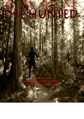
The technical side of my production work was the better part in my opinion because I got to play with my ideas rather than jot them down on paper. In my poster I got to crate the image I had taken into exactly how I wanted, I used Adobe Photoshop 7 for this to create a dark looking effect, and I also made the main character into a solute, so that the audience know that the film is mainly going to be set in the dark, I used the paint tool and then the clone tool so I could get the image to look the same. I then played around with the text which I got from 1001fonts.com, so that the audience know that the film is mainly going to be set in the dark. I then played around with the text which I got from 1001fonts.com I chose a font which was rather creepy to fit with the image. I chose this particular font because it worked well with the image on my poster. I also played around with the other fonts I was using for the release dates and actors names, I used the text tool for these so I could find an effective but simple font. For my magazine this took a lot more time and used a loot more tools, I found some images on Google of film reels, and negatives. I then used one and got lots of film posters using the scale tool I cropped them down to size, and the used the free transform tool and moved them to exactly where I wanted them to be. The film trailer I had to produce used a lot of technical features, for example I had to use a Canon MD205 portable video recorder to produce the footage I wanted, I also then needed to use a tripod to place the camera on to prevent shaking in the footage. I then used a fire wire to get the footage of the camera so I could edit and put the footage on the computer. Once I was on the computer I used a program called Adobe Premiere Pro 1.5 to edit the footage recorded. In this program I used all sorts of different tools I used things like colour corrections to change the colour of the images to black and white and also dulled the colours. I also used tools to make the different clips go in slow motion the tools I used for these effects where the razor tool to cut and stretch the clips. I then created my own effect which was the blink of and eye effect I did this by creating a box at the top and one at the bottom of the clip, I also added a camera click to the clip to make the audience think that the stalker was taking pictures of its victim. I also added a scream sound to the end clip to create a dramatic effect at the end of the trailer, I also made this clip into slow motion too add an even more dramatic effect. My video communicates dramatic effect to the audience, I created this by having some of my clips in slow motion this worked really well especially when we saw the only image of the ‘stalker’ following the victims footsteps, this worked better in slow motion because it said to the audience that this film is going to create a lot of tension and edge of your seat action. I also created this by the last shot I had in the trailer where the star is on the phone and comes face to face with the ‘stalker’ I decided to have this clip in slow motion as the actress screams because it creates a dramatic effect to the audience and lets then know that she does eventually come face to face with the ‘stalker’ in the movie. Also by having this as the ending creates a dramatic feel and leaves the audience wanting too see more to find out what happens.
During this production I felt like I could of improved in a many different areas and created more effective work, for example I could have analysed more film magazines and more film posters so I could understand properly what there is needed to include to every aspect and how they address the audience. Also during this production I came across many complications so if I where to do this again I would consider main actors/actress and then a back-up plan just in case the fact that people can be in it then can’t because they can’t make the times set in the shooting schedule happens again, then I could use a proper group of people and still stick to the original script and plot and not have to change everything because this then delayed the filming progress because I had to change my script, plot and re-do the storyboard. I would also change the video and produce something else because in our storyboard I had loads of different ideas I wanted to create for example a crash zoom but with using these portable cameras I was restricted to do this because the camera only had one zoom speed and it was really slow, also when zooming it lost the quality so I had to stick with one frame shot. If I where to do it again I would make my storyboard simpler and less complications so that I could then in turn use what I had at hand effectively. Also by using the camera I had to do a lot of voice over’s because where the camera was placed to where the person was stood I couldn’t hear what they where saying because the camera wouldn’t recorded the sound properly, this created complications and took time to alter so that during the editing stages the audience would then in turn be able to hear what was been said. Also I would consider the editing as this was new to me, if I were to do it again I would now know how to use the edit suite and the programme Adobe premier pro 1.5 and be able to play around with the different effects and get my footage to exactly how I wanted it. Also with my other task’s I would have looked more into analysing posters and magazines of the same genre to my trailer so that I could understand what I needed to put in it more, although I do think that the magazines and posters I looked at and analysed did help a lot in giving me a good understanding of the main aspects and features need to make a good professional poster and magazine cover. The strength’s of this production where that I had a good understanding of using most of the equipment and programmes asked of me so I was able to make good progress with the task’s at hand, and create them to how I wanted them too look. And also I was able to reach the target audience by creating the different features. If I where to do this again I would make the poster and magazine more professional and I would of also used a variation of different programmes to edit the images that I wasn’t able to access at the working environment.
Friday, 7 May 2010
Film poster.

This is my final poster. I have chosen the design to be like this because it works well together. I have chosen to use a solute as the main character rather than the main characters face, this is because in the trailer it creates a sense of mystery not been able to see the stalker I thought i would use this idea throught the task's and dot he same on my poster and magazine cover.
Friday, 30 April 2010
Other elements

These are the other elements used on the trailer. We created our own production logo as apposed to using 'universal'. To create this we came up with the name 'Tower Productions' so to create the logo we just got a picture of an old castle and made the image black and white, we then got some text and made it red, to go with the genre of our trailer, which was also an idea because it suggests that this production company dose lots of horror films. The other element was there to make our trailer look more professional, and that no one can copyright out trailer.
Thursday, 15 October 2009
Film poster analysis 2.
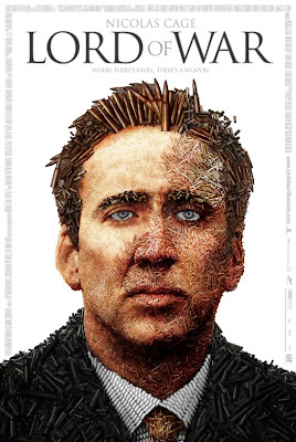
 This is a poster to advertise a new film called 'Lord Of War' which is an action film we can see this by the image been the main actors face made out of shells and bullets. This works effectively because we can still make out the face of a well famous actor 'Nicolas Cage' by having this actor in the poster suggests to the audience that its going to be a puzzle style film by all the other films he has been in with action. The image is very clever because not only it been the actors face but also about the movie with it been made up of bullets and shells. This poster works well as a whole because it is effective with the construction and that makes it professional and convincing. There are different types of fonts on the poster, even in the film title 'Lord War' are one separate text to 'Of' this works really well together because they are both the same font just different colours and sizes. however the 'Of' is the same as all the other texts like the actors name which is a well recognised actor from good films such as 'National Treasure' and 'Ghost Rider'. There is also a quote underneath the film title which says 'Where There's A Will There's A Weapon' which also suggests to the audience that this film will have crime and drama as the set genre. We can see that the target audience would be males possible females aged 15-45, we can tell this by the main image and the slogan underneath the film title, also the text that is used.
Film poster analysis.

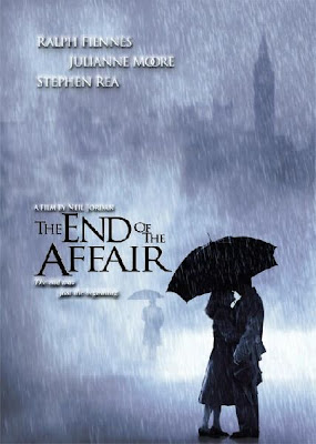
This poster to advertise the new film 'The End Of The Affair' is a romantic film genre, we can see this by the way that the focal point is in the couple down at the bottom, and that they are sharing an umbrella in the rain. Also how the couple are the only image in focus, everything else is blurred in the background. With the poster been in black and white suggests that this could be advertising a sad romantic film, we can also suggest this by the fact that its raining, I think that this works really well in advertising the film. The title of the film is placed int he middle but at the left hand side, the font of the text works really well with the background and the images on the poster, the text is plain and simple, which works effectively to address the target audience. 'The End Of The Affair' makes and interesting title to suggest that the movie is about romance however also sadness, with goes alongside the rain and the dull colours on the poster. With the quote underneath the title 'The End Is Just The Beginning' Suggests the total opposite of the main title that there will be happiness in the move, but not for everyone. By looking at this poster we can see that the set target audience would be females aged 15-45, we can see this by the image in the left hand corner that the couple are in the rain holding one umbrella which means they are stood really close, the suggests the romance of the movie. With advertising the director says that this is a good effective movie because 'Neil Jordan' has worked on many successful films, and advertising actors and actress's on the poster, that the audience will recognise draws the audience in and makes them want to see the film. The font's on this poster are all different sizes like the main title is the largest text on the poster, and is also in a different colour and font to the rest of the text on the poster, so that the audience can recognise the name of the movie. All the other texts are in a smaller font and different style but all the same colour because they are all advertising names of the director and the actors and actress's. However there is one text that is different to them all which is the quote underneath the title which is the same colour as the others but is in italics, this adds to the effect on the poster. The poster is very cleverly designed in the way that is not to cluttered and works really well and effectively.
Subscribe to:
Comments (Atom)


