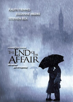
This poster to advertise the new film 'The End Of The Affair' is a romantic film genre, we can see this by the way that the focal point is in the couple down at the bottom, and that they are sharing an umbrella in the rain. Also how the couple are the only image in focus, everything else is blurred in the background. With the poster been in black and white suggests that this could be advertising a sad romantic film, we can also suggest this by the fact that its raining, I think that this works really well in advertising the film. The title of the film is placed int he middle but at the left hand side, the font of the text works really well with the background and the images on the poster, the text is plain and simple, which works effectively to address the target audience. 'The End Of The Affair' makes and interesting title to suggest that the movie is about romance however also sadness, with goes alongside the rain and the dull colours on the poster. With the quote underneath the title 'The End Is Just The Beginning' Suggests the total opposite of the main title that there will be happiness in the move, but not for everyone. By looking at this poster we can see that the set target audience would be females aged 15-45, we can see this by the image in the left hand corner that the couple are in the rain holding one umbrella which means they are stood really close, the suggests the romance of the movie. With advertising the director says that this is a good effective movie because 'Neil Jordan' has worked on many successful films, and advertising actors and actress's on the poster, that the audience will recognise draws the audience in and makes them want to see the film. The font's on this poster are all different sizes like the main title is the largest text on the poster, and is also in a different colour and font to the rest of the text on the poster, so that the audience can recognise the name of the movie. All the other texts are in a smaller font and different style but all the same colour because they are all advertising names of the director and the actors and actress's. However there is one text that is different to them all which is the quote underneath the title which is the same colour as the others but is in italics, this adds to the effect on the poster. The poster is very cleverly designed in the way that is not to cluttered and works really well and effectively.
No comments:
Post a Comment